
Visualising and Communicating Data
Data visualisation is used in one way or another in most sectors, from teachers, builders, and researchers, and is usually done using maps, graphs, charts, tables etc. to show patterns, trends, outliers etc. in data sets. Data Visualisation and Communication means the graphical representation of data as well as the oral and/or written presentation of it. In other words, the translation of information into a visual context that makes it more accessible and easier to understand for a broader public. Communication strategies for delivering the data refers to the techniques and methods used to facilitate understanding and inspire engagement and action on a certain topic, issue, or research finding.
No matter how fascinating the findings may be, most of us get bored by monotonous and long public talks with an overly packed PowerPoint presentation. Rather an energetic speaker with a passion for the cause, a good understanding of the audience and the atmosphere in the room, using relatable examples packaged in simple but effective slides or infographics , videos or dashboards can produce standing ovations and inspire to the core. Global public health and statistics guru Hans Rosling, for example, was an expert at this and managed to inspire on mass with his 2013 TED talk where he was “debunking myths about the so-called developing world”. Even if you’ve seen it multiple times already, it’s worth another look to get inspiration on truly effective communication and visualisation of meaningful data!
It’s not always easy to know where to start and how to think about the various aspects of data visualisation and communication. Herein, a visualising and communicating data toolkit is presented to facilitate this journey. It is made up of a set of guidelines, examples and a combination of recommendations when looking to leverage modern data communication techniques/approaches to increase understanding and make your own and others’ research findings and implications more useful and relatable to aid sustainable health. This tool will help you to critically think about your audiences, the packaging of your findings, desired outcomes of your communication efforts, and more, which are key for solution uptake.
The Toolkit
The “Visualising and Communicating Data” toolkit is presented here as a three-step process. Each step contains a set of tips and referred list of methods/tools on Data Visualisation (DV). The steps are: Step 1) Visualise, Step 2) Package, and Step 3) Communicate: Present & follow-up
The Basics
Before picking any data visualisation or communication tools, it is important to think critically about how you intend to unveil/present your findings to derive impact. For example, you need to have a goal and purpose, think about your audience, and identify the key findings to be highlighted. This is then followed by developing a workflow that includes data visualisation and communication. Guidance on these can be found in this toolbox.
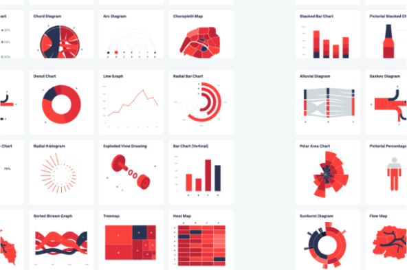
Source: datavizproject.com
An animated chart with Python and Image Magick.
Source: www.python-graph-gallery.com/animation/
Example of fact sheets.
Source: Institute for Public Health, Kuala Lumpur, Malaysia
Source: public.tableau.com/app/discover

Want to know more?
There are many other recommended literature as references when you are digitalising the data. We have compiled a deep dive for you who like to read up more on the link below.
We wish you the best of luck digitalising your information and data!
DOWNLOAD FULL LIST OF REFERENCES

Operated by Karolinska Institutet in Sweden
and Makerere University in Uganda