
CESH Blog: Transforming Data into Impactful Stories

 By
By When I hear the term “data,” I envision a vast, unstructured landscape brimming with untapped insights. At the same time, I often feel overwhelmed by the challenge of making sense of it all.
A key question many of us grapple with is:
- How do we transform raw data into compelling narratives that resonate with our audience?
- More importantly, how do we refine research insights into content that is accessible, digestible, and engaging?
I once thought data visualization was just a sophisticated term for graphs and charts. However, I’ve come to realize it’s much more than that. Effective data visualization starts with a purpose—engaging the audience with relevant information and inspiring them to take action, particularly in an era of shorter attention spans and information overload.
Communicating data effectively is not just an academic skill; it’s a tool that fosters critical thinking and enhances learning. Since our brains process visuals much faster than text, data visualization becomes essential for simplifying complex ideas, improving retention, and creating a lasting impact. I’ve learned that visual representation significantly enhances data analysis, helping us interpret information more effectively and uncover deeper, more meaningful insights. These skills are invaluable—not just in research, but across professional and real-world applications.
As I reflect on my journey, I now fully appreciate the competitive advantage that mastering data visualization provides in today’s data-driven world. Across industries, data-driven decision-making is the norm, making the ability to interpret and communicate visual data a powerful asset. The question is not whether to develop this skill but rather how to maximize it. Whether you're working on a thesis, research project, or professional assignment, data visualization is a critical skill that will set you apart.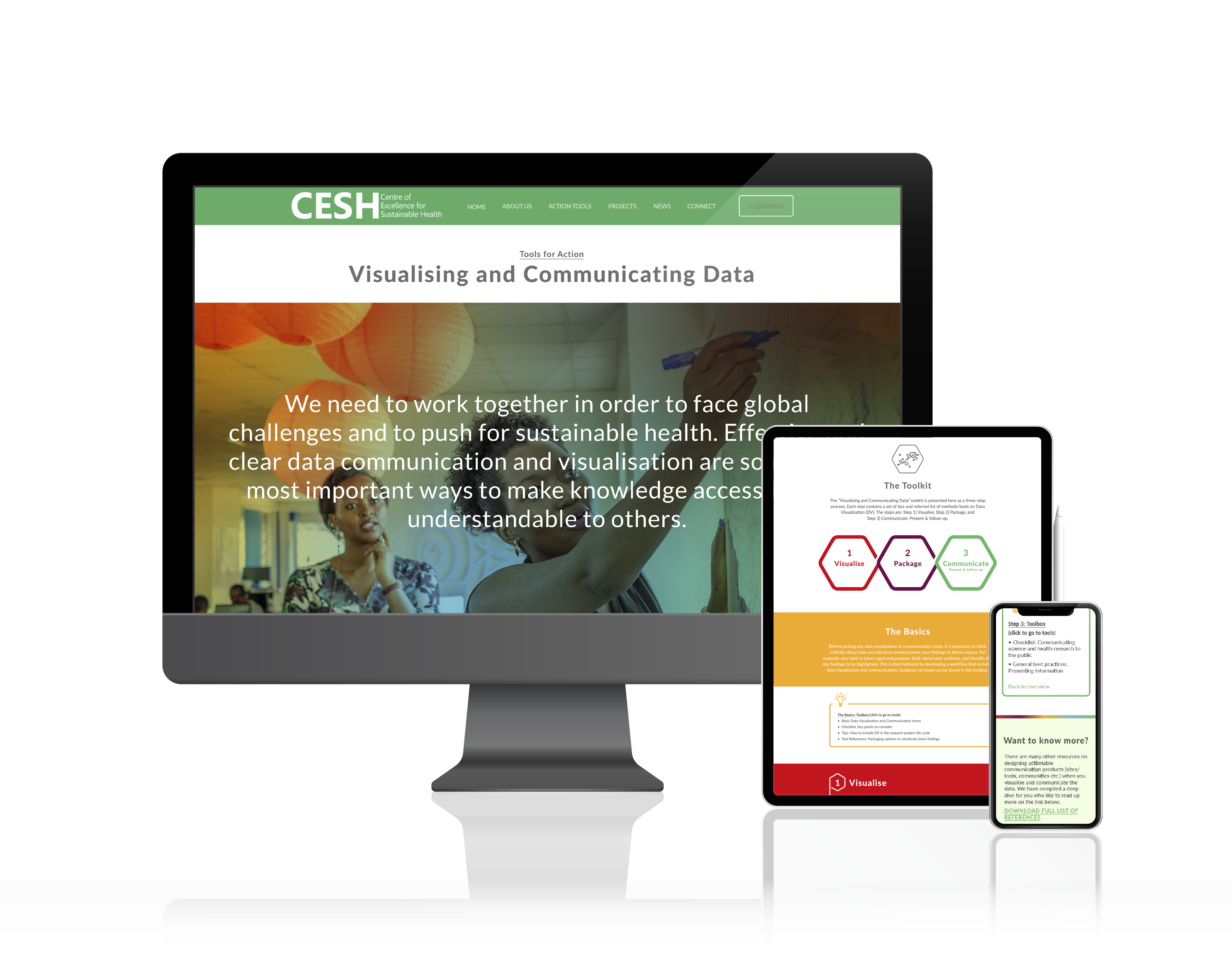
It was through my introduction to the Centre's Visualizing and Communicating Data Tool—part of the Tools for Action toolkit—that I truly realized the value of presenting my findings in a meaningful way. This resource offers guidelines, case studies, and strategic advice on modern data communication techniques, ensuring that my work serves not only to inform but also to inspire.
Visualizing and Communicating Data tool acts as a one-stop guide for mastering data storytelling, following a three-step process to help you effectively present data-driven insights:
- Visualize the data
- Package the data to create a compelling story
- Communicate your narrative effectively to your audience
I highly encourage you to discover more valuable toolkits—just a click away!